Showing posts with label Sheet-y Saturday. Show all posts

Saturday, July 27, 2013

Sheet-y Saturday.

Where we take a look at posters for upcoming features.

I am such a sucker for famous people playing famous people and the trailer for Saving Mr. Banks hit all the right notes (look it's Tom Hanks with a mustache cavorting with Tinkerbell!). It helps that Mary Poppins is one of my most favorite movies ever of course, which is why this poster seems so cute. That might not be the most professional way to describe something, but who can look at this and not think "OMGZ cutest thing ever", "it's Mickey and Mary!" or "awwww" all the way through the theater lobby after they see it?

Disney marketers, you've once again stolen my heart. Have they stolen yours too?

Saturday, July 13, 2013

Sheet-y Saturday.

Where we take a look at posters for upcoming features.


If there is one kind of film Naomi Watts has yet to perfect, it's the biopic (yes, yes, but The Impossible doesn't really count, now does it?) yet judging from her flawless makeup, demeanor (that pose!) and the grace with with she presented herself in the teaser, it seems like she'll be stunning as the late Princess Diana. It's good that the film allows us to look at her and be lost in the resemblance, something that never happened with Michelle Williams as Marilyn for example...

What are your thoughts?

Saturday, January 19, 2013

Sheet-y Saturday (Fave Posters of 2012)

In no particular order (both because I'm lazy and because I really like them all)

Portrayed the exuberance and joi de vivre the film teasd about having but ended up lacking. It's an image of pure joy captured in a single moment.

Merida gives her back to the world proving just how she's setting herself apart from all other Disney princesses. Brave move indeed.

After reading Pattinson and then Cronenber, you're like "wait, what?" but the matinee idol's look of quiet despair hooks you.

If ever a movie's visual idiosyncrasy was captured by its poster, it's this. 

You can not look at this and not giggle. If only the rest of the marketing campaign had been this Hitchcockian...

Saul Bass brilliance for a noble cause. 

It's like a flyer from an actual strip club. You just wanna do jello shots after looking at it.

Like the cover of a 70s exploitation movie or a bad paperback. 

Promises a mystery larger than what the movie actually contained. 

This redacted title with no movie star names, no "from Oscar winning director" and no release date might be the greatest movie poster of the year (maybe I did have a favorite). Simple, effective and haunting.

What were your faves this year?

Sunday, August 12, 2012

Sheet-y Saturday (on a Sunday)

Where we take a look at posters for upcoming features.

All eyes are set on Kathryn Bigelow's followup to the astonishing The Hurt Locker and considering she's once again dealing with boys' territory she might just blow our minds again. So far the campaign for Zero Dark Thirty has been rather tasteful. This redacted teaser poster for example forces us to look closer, to examine more and considering she isn't even showing us any of the famous faces in the movie, it's safe to assume Bigelow is on her top game. 

Only god knows what this movie's about, but why - one wonders - is it falsely advertising the actors in it or have the actors been so photoshopped they look unrecognizable?
Why does Uma look like Katherine Heigl? Why does CZJ look like Keira Knightley and why oh why does Dennis Quaid look like a Tom Cruise impersonator? The horror! (Said horros is clearly expressed in Gerard Butler's WTF face)

Saturday, July 14, 2012

Sheet-y Saturday.

Where we take a look at posters for upcoming features.

May Tim Burton redeem the last decade or so with Frankenweenie...this lovely one sheet holds the promise of some of his most iconic work and the fact that a non-cadaverous Johnny Depp is featured anywhere should be a good sign. Gotta love the folds and scratches that make it seem as if they just ran into a B sci-fi movie and are releasing it for the first time.

Magic Mike still has the best poster campaign of any movie this year. This 4th of July offering is truly delicious and not just for the obvious reasons. Just look how they completely avoided the peen to remind us that independence is all about freedom of expression.

When i first saw this poster for the last (bless you Lord) Twilight movie, I honestly thought it was a teaser for the next season of America's Next Top Model. Whoever this actress is, she's surely channeling Tyra's fierce "you go bitch" look.

Right?

Saturday, July 7, 2012

Sheet-y Saturday.

Where we take a look at posters for upcoming features.

The last time we had a sumptuous, lose your life and cry your eyes out, epic melodrama was probably around the time when Joe Wright delivered his astonishing - and despite all the awards, seriously underrated - Atonement. His take on Tolstoy not only looks astonishingly lavish and gorgeous, it also shows how playful he can be as a director. What sounds like a Brech-meets-Visconti take could very well be the most mesmerizing movie of the year and judging from this absolutely gorgeous poster this is one movie that might just blow us all away.

Saturday, June 30, 2012

Sheet-y Saturday.

Where we take a look at posters for upcoming features.

Can we all agree this Russian poster for Magic Mike is the best poster of 2012 (so far)?
Yes? Why? do you love the bold title design and overall selfawareness as much as I do or do you think you've seen better graphic design at actual strip clubs? 

Saturday, June 16, 2012

Sheet-y Saturday.

Where we take a look at posters for upcoming features.

Whoever orchestrated the advertising campaign for Prometheus deserves a thousand awards. Each trailer, teaser and graphic piece has been instantly iconic, clever and appropriate for the medium. Just see how for the Imax poster they're putting emphasis on the scope of the thing. A tiny Noomi Rapace finding the huge head from the movie, gives audiences an idea of the huge cinematic ride they're in for. If this isn't what a poster should be doing, then someone please enlighten me.

Saturday, May 19, 2012

Sheet-y Saturday.

Where we take a look at posters for upcoming features.

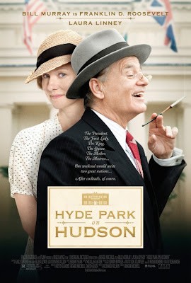
Few things worry as much as listening to something being compared to The King's Speech and this movie about FDR has been getting such notices. It's easy to assume then that it's going for complete "let's win Oscars and make middlebrow people weep" intentions to which I say fuck this!
However we haven't even seen the movie yet and Bill Murray is a fantastic actor. The poster does scream Speech a bit, but I'm truly loving Laura Linney in it, am I the only one getting a totally Kristen Wiig as Gilly vibe from her gesture?

Most Bond teasers look the same and to that I say, some things should never be messed with.

Are you tired of the same 007 concepts time after time or would you like the franchise to start trying new things?

Saturday, April 28, 2012

Sheet-y Saturday.

Where we take a look at posters for upcoming features.


Even if this poster is absolutely ridiculous in terms of laziness (Nancy Meyers much, anyone?) there is something about Meryl Streep that always makes everything better. Her sly look and smile in this picture, accompanied by the title of the book she's reading, tell us more about the movie than the trailer! Apparently the marketing team was aware of this and they decided to concentrate just on the picture and make the rest a mess of typography, colors (where should I read first?) and unreadable taglines.  

Charlize Theron is badasssss and that's pretty much all there is to this.

Which of these two do you think represent their movies best? Excited about post-Oscar Meryl?

Saturday, April 21, 2012

Sheet-y Saturday.

Where we take a look at posters for upcoming features.

Jacques Audiard has a pretty much impeccable record when it comes to making movies. Not only have all his movies given actors the chance to truly shine and explore darker characters, they also have established him as a visual force to be reckoned with. Rust and Bone sounds impossibly hard to understand on paper, but just take a look at the cast, the director's reputation and the gritty marketing campaign they've been using so far. Cotillard seems to be loving the getting down and dirty thing she hasn't really had a chance to do so far, seriously people Edith Piaf wasn't "gritty" and Schoenaerts is fresh off the superb Bullhead in which he pretty much played an animal. The fact that the poster highlights them without really focusing on them is rather interesting. Where is he carrying her? Why is he carrying her? Why is she looking down? Can someone just please release this movie right now?

Saturday, April 7, 2012

Sheet-y Saturday.

Where we take a look at posters for upcoming features.

Oliver Stone has been failing to set screens on fire since the early 90s. Was JFK truly his last great movie?
The wishful thinking that Stone is set to deliver something as vibrant as his classic work is what drives me to put all my hopes on Savages. The poster for this movie is a multicolored joy to watch as it presents us with all the A-star cast looking like they just left a Tarantino audition. The use of such vibrant colors makes this look like a dun version of Babel and I'd board that train anytime.
Best of all is the way in which all the actors were captures, del Toro looking like a demon out of hell, Hayek making the most of her mouth-barely-open pose, Travolta exuding his Scientology madness and Lively looking like the slutty ingenue. Without even knowing what the movie is about this one-sheet hooks you and isn't that what posters are supposed to do?

Saturday, March 31, 2012

Sheet-y Saturday.

Where we take a look at posters for upcoming features.


With horror posters going lazier and lazier every day, it was quite refreshing to see this one-sheet for The Cabin in the Woods, which is comprised of...wait for it, critics' blurbs! It probably makes sense that if you make a horror movie and it, gasp, gets good critical notices, you're going to want to feature them somewhere. Then again if you have the likes of Chris Hemsworth in your movie you'd also want to show him, right? The boldness of this poster alone is enough to guarantee I'll be watching this ASAP.

When you're a Woody Allen movie you have to be prepared to receive criticism for every single thing you do. If you're good, you still will never be as good as Annie Hall, if you're bad, you're an offense to humanity and your maker should suddenly be arrested and jailed for marrying his step-daughter. If your maker cared about all the crap people will say about you, you'd never be released. However your maker loved making you so much that you should be proud of him and face the world with dignity. Who cares if your poster looks like it was put together by Nancy Meyers' sloppy marketing team? At least you can brag about boasting one of the most charmingly peculiar casts ever put together.

Excited about either of these releases? Wondering how on earth can Woody still make a movie a year?

Saturday, March 24, 2012

Sheet-y Saturday.

Anyone would've assumed that whenever talking of The Great Gatsby the first image that would come to mind would be that of well, Jay Gatsby. Leave it to the brilliant genius that is Baz Luhrmann to reveal that the focus of his attention will in fact be Daisy, played in his movie by the astonishing Carey Mulligan. Here's the thing, Carey has one of those faces that inspire awws and heart shaped gestures, however she has never felt like a true "woman" in the sense that her ethereal beauty rarely allows her to become a fully sexual being. The Carey we are presented in this poster though has a different pair of eyes (kudos to the makeup department as this will surely be yet another Baz beauty extravaganza) eyes that seem wiser. However the real question is why did Baz choose to hide Leo's unarguably more recognizable face?

Share your thoughts!

Saturday, March 17, 2012

Sheet-y Saturday.

Where we take a look at posters for upcoming features.

Every body and their mothers seem to have a soft spot for Tim Burton. I have never found myself seduced by his tiresome odes to the macabre, especially those in which he teams up with the oh-so-dull Johnny Depp. However the trailer for Dark Shadows hit this week and it seems everyone wants to see it, so who am I to deny audiences the pleasure of doing what they want?
The poster does nothing new to the kind of advertising Burton often goes for, notice how HBC looks like his version of Willy Wonka? I am only curious to see what Michelle Pfeiffer and Eva Green bring to the table...

Another movie about fighters that goes for yellowish meets shadowy art. Groundbreaking...

What's your take on these two one sheets? Am I especially bitter this time around or are these are dull as I think?

Saturday, March 10, 2012

Sheet-y Saturday.

Where we take a look at posters for upcoming features.

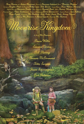
Up until a few minutes ago I had no idea what Moonrise Kingdom was about, now that I know, this poster is a thing of beauty. However before finding out what the plot was, the poster gave me a slightly creepy vibe, it reminded me of a Todd Solondz movie and we all know those aren't exactly fuzzy and cute.

What does the Moonrise Kingdom one-sheet say to you?

Saturday, March 3, 2012

Sheet-y Saturday.

This exclusive poster for John Carter was designed by J.C. Richard for a special Mondo screening of the upcoming film and it's utterly perfect. The soft colors recall the excitement of finding a washed out sci-fi paperback among your dad's belongings and the detailing demands you look at it forever. The canyons, the color of the skies, the planets above, the thrill of that beam coming out of a spaceship...and then the single human being standing in awe of all of this. This one sheet makes us become John Carter and as such it's truly a work of art.

Excited about this movie?

Saturday, February 11, 2012

Sheet-y Saturday.

 Where we take a look at posters for upcoming features.

Whoever is behind this one sheet for Mirror Mirror had only purpose in mind: destroy Tarsem movies from having flawless poster designs. Check out the posters released for The Cell, The Fall and Immortals all of which were visually intriguing movies, with imaginative graphic campaigns. What we have here is Photoshop gone seriously wrong and also slightly plagiarist.
For starters, do not showcase your movie's castle when Princess Jasmine isn't anywhere to be found, wait, are you telling me this isn't the castle from Aladdin?
Next, do not have Armie Hammer look like he's still wearing J. Edgar old age makeup...he's supposed to be the prince, not Snow White's creepy stalker. Next, do not make the elves look like a comedy troupe out of a Chelsea Handler fantasy. Last but not least, don't make people believe your heroine has no arms. Unless this is also an adaptation of Wicked, Snow White was never known for her lack of limbs. Seriously, the teasers featuring individual characters were much, much nicer. 

After the overloaded disaster we just saw, this poster is absolutely breathtaking. I don't even know what the movie's about, but the way in which they captured the imminent disappearance of love (don't you want to just try and contain those falling streams from dissolving the couple?) makes me already ache for how heartbreaking this movie will be.

What's your take on these puppies?

Saturday, February 4, 2012

Sheet-y Saturday.

Where we take a look at posters for upcoming features.

I am the first to criticize Hollywood's laziness in re-releasing their classics in 3D but I'm also the first to jump overboard just to show how much they love Titanic. This is the movie that made me fall in love with the idea of movies as things that transcend time and space. My tastes may have become more sophisticated since, give me a break I was 11, but I still defend this movie's corniness whenever people attack it.
See this poster for example, the ridiculous pink skies and the ship in movement, suggest something straight out of a bad Asian hologram postcard or a cheesy karaoke video, but there is something about the tacky embossed logo, or the doe-eyed looks in Leo and Kate's faces that just goes "click". It's sigh inducing and nostalgic all at once.

How do you feel about this re-release?

Saturday, January 28, 2012

Sheet-y Saturday

Where we take a look at posters for upcoming features.

Whoever is behind the marketing campaign for Shame most certainly knows what he's doing. Each of the film's posters have been more brilliant than the previous and they all sum up the film's concept without recurring to using Michael Fassbender's face. Take this Hungarian poster for example, the way the title is spelled gives it an instantly erotic level, that's mostly marked because it feels so revolting at the same time. It's sensual and exhibitionist, but it also puts into perspective the character of whoever spewed the title out. Can you help but feel deep empathy for his sorrow? The poster was banned upon its release.